LOGO STORY

This logo artwork shares the story of City Indigenous Group.
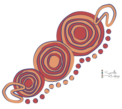
The three gathering circles central to the design hold a twofold meaning:
- Highlighting a commitment to reconciliation through the three key focus areas being respect, relationship and opportunity; and
- The organisations vision to create a future of mutual respect and harmony through collaboration.
Three rings within each gathering circles reflect the delivery of unmatched quality, value and consistency across a wide range of property services alongside a commitment to investing in people, infrastructure and process controls.
The gathering circles grow in size, holding valuable meaning within the design, as this imagery depicts the organisation’s:
- Investment in a Sustainable future for Australia’s First Passion for leading reconciliation and the offer of improved quality of life for Aboriginal & Torres Strait Islander people.
- The stepping stones that make up the journey pathway number 17, reflective of the services provided by City Indigenous Facility Services.
- Traditional people symbols (U) at each end of the design, face inward, highlighting the organisation’s joint venture and valuable partnerships across stakeholders
This imagery reflects its about people and commitment to long term relationships and collaboration with Aboriginal and Torres Strait Islander people and valuable clients.
Journey pathways flowing across the bottom of the design reflect the business’s sustainability and growth through past, present and future opportunities, while depicting the ongoing quality services provided by City Indigenous Group.
